Heriot Hott Sauce
Heriot Hott is an Edinburgh based hot sauce business! Aiming to deliver deliciously diverse hot sauces


Branding Breakdown
Logo
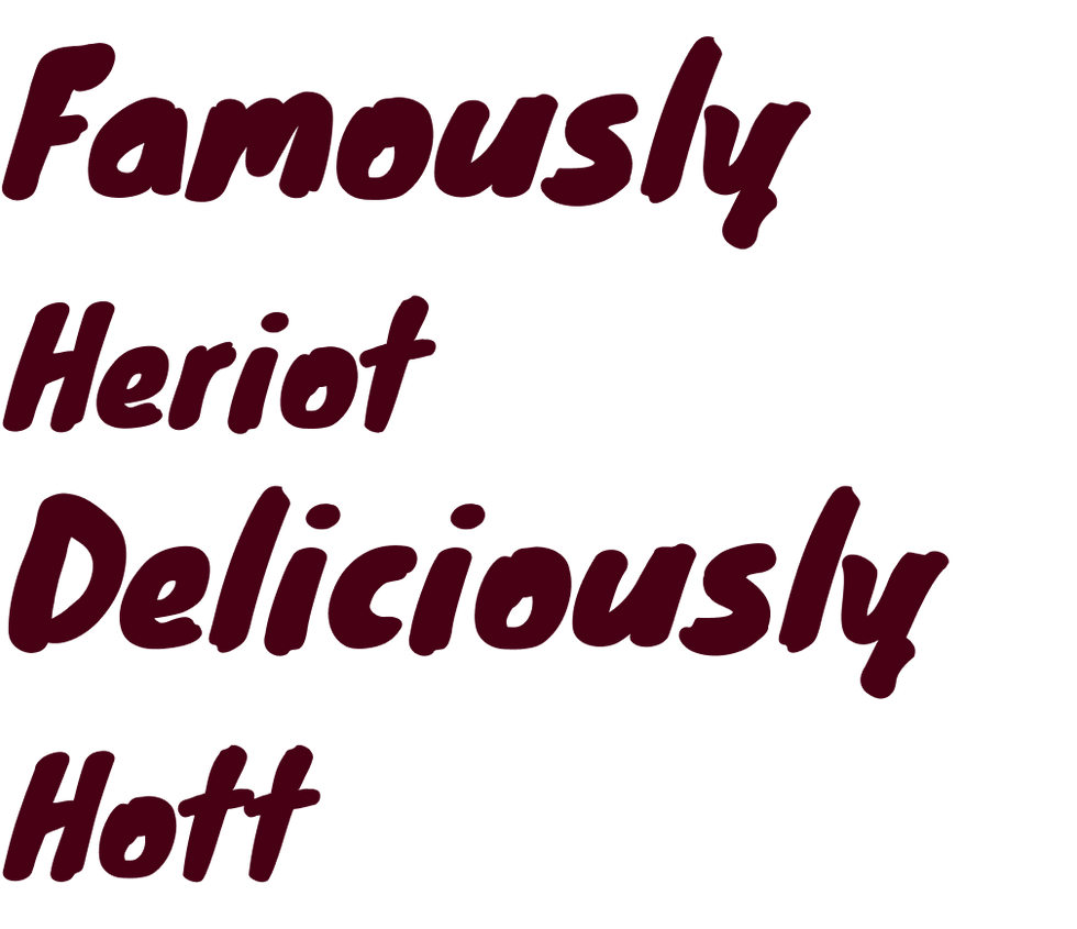
Drawn entirely by hand, this logo was inspired by Western serif fonts. It draws heavily on 19th-century Americana and historical traditions, resulting in an extremely decorative aesthetic. The subject matter itself emphasises history within its marketing, so I sought a font reminiscent of those used in a printing press room. The logo needed to possess a dynamic quality, as if it were bursting into flames.

Type
Knewave shouts in a bold font about our brand. Used for titles and strong eccentric language.
Arial Rounded is used for paragraph and body text. Simple, easy to read and still thick in weight, it allows customers to read small details found on the side of the bottle.

Colour Palette
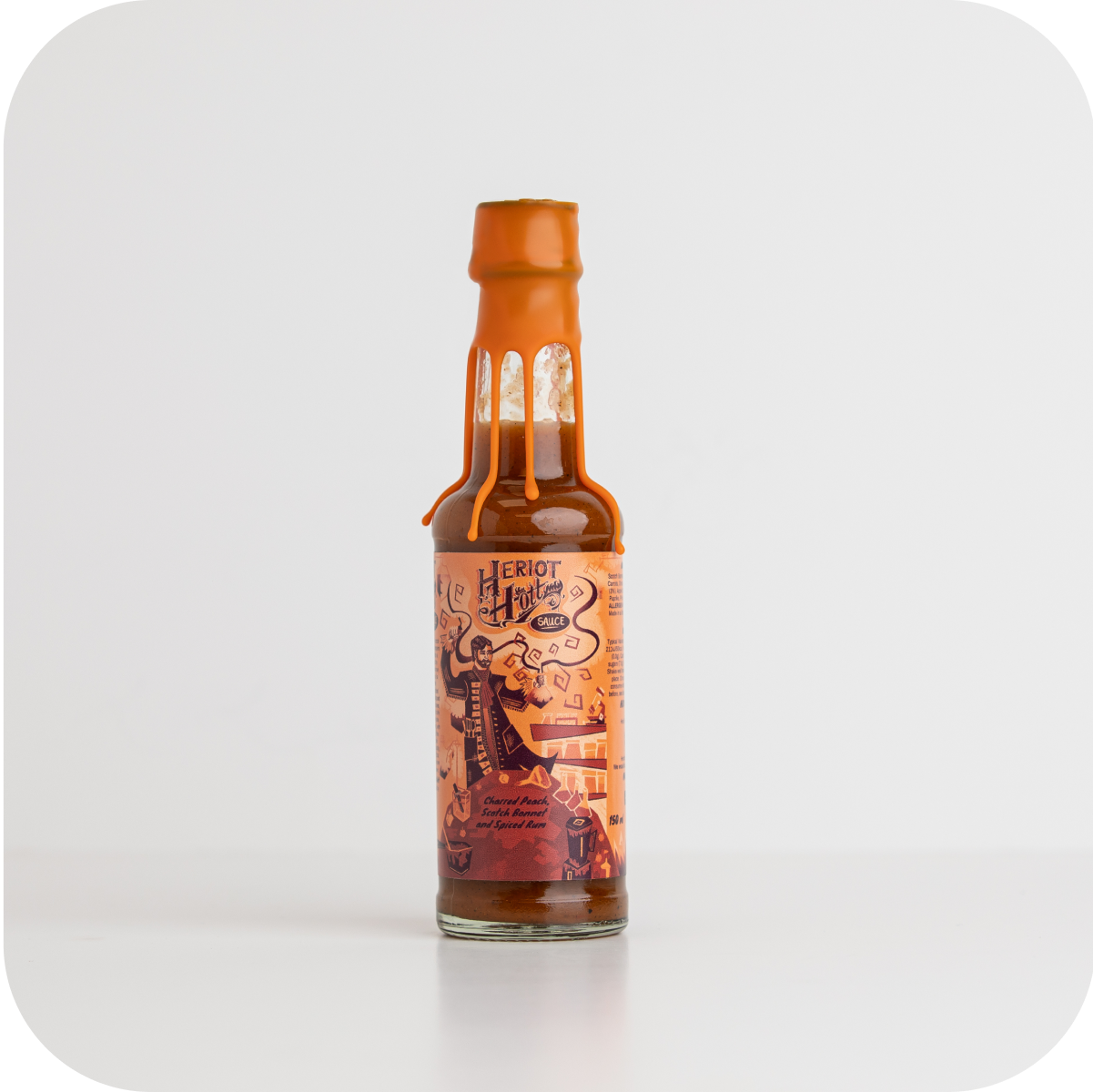
We selected four primary colours that are consistent across Social, Web, and App platforms. These colours evoke the sensation of heat or fire: reds, dark maroons, fiery oranges, and a skin tone for character design. We also utilise a diverse range of secondary colours to embellish our label designs. These secondary colours are not bound by strict rules or guidelines, allowing them to enhance the product's appeal.

Target Audience
Predominantly male, 21 - 45 age.

Brand Personality
An illustrated character called Professor Heriot Hott. The son of James Watt and George Heriot. Inspired by the owners upbringing at Heriot Watt university. A scientist within the food industry that goes on numerous adventures exploring the world of chillies in and out of his laboratory.